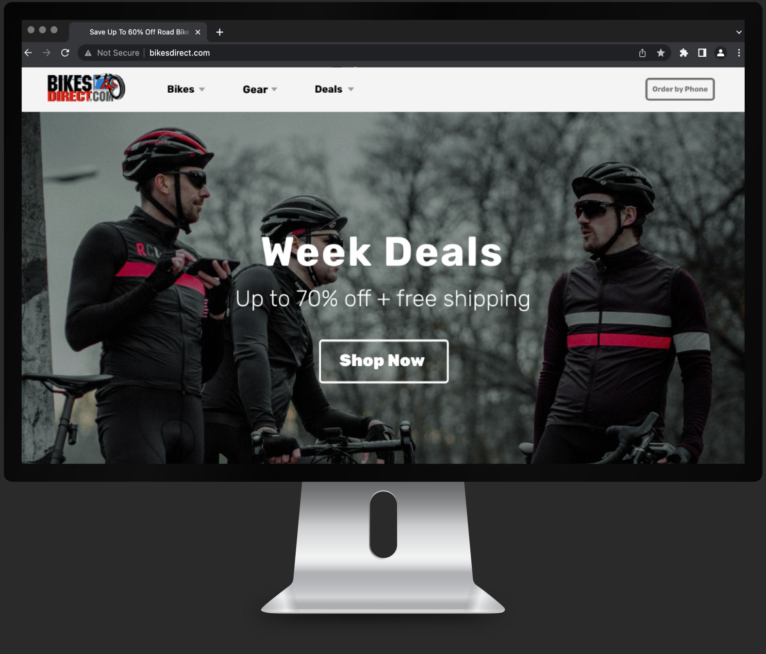
Case Study: Website Redesign.
Home page, menu and purchasing & checkout iteration.
Overview
Bikesdirect.com is a company that sells bicycles directly to customers through an online store. They aim to enhance their current website to provide customers with an optimal shopping experience, increase sales, and boost brand awareness.
The Challenge
Bikesdirect.com has an outdated and difficult-to-navigate website. Visual inconsistencies in the interface and architectural information contribute to this issue. As a result, customers experience distrust and confusion, leading to stagnant sales growth.
The Goal
The goal is to create more impactful and intuitive experiences to build trust in the audience and increase conversion rates by establishing a user-centric redesign, prioritizing usability with intuitive navigation and cohesive visual design.
The Iteration Process

Research
Contextual inquiry: Observation, user interviews, and desk research,
Based on the research, the most significant pain points include
- Lack of trust due to security concerns and disorganization on the homepage.
- Confusion and absence of clear action steps while navigating through sections.
- Overwhelming amount of information.
- Random use of colors, graphics, and design elements.
In some instances, users have expressed sentiments such as, “‘What’s all this?!'”, “I’m not buying anything here”, and “This looks sketchy”.
In light of these findings, the website needs visual improvements and a simplified structure to showcase offerings and shopping pathways. Adding more visual aids, and maintaining consistent patterns with colors and design elements will enhance the overall user experience.
Ideation
Site Map
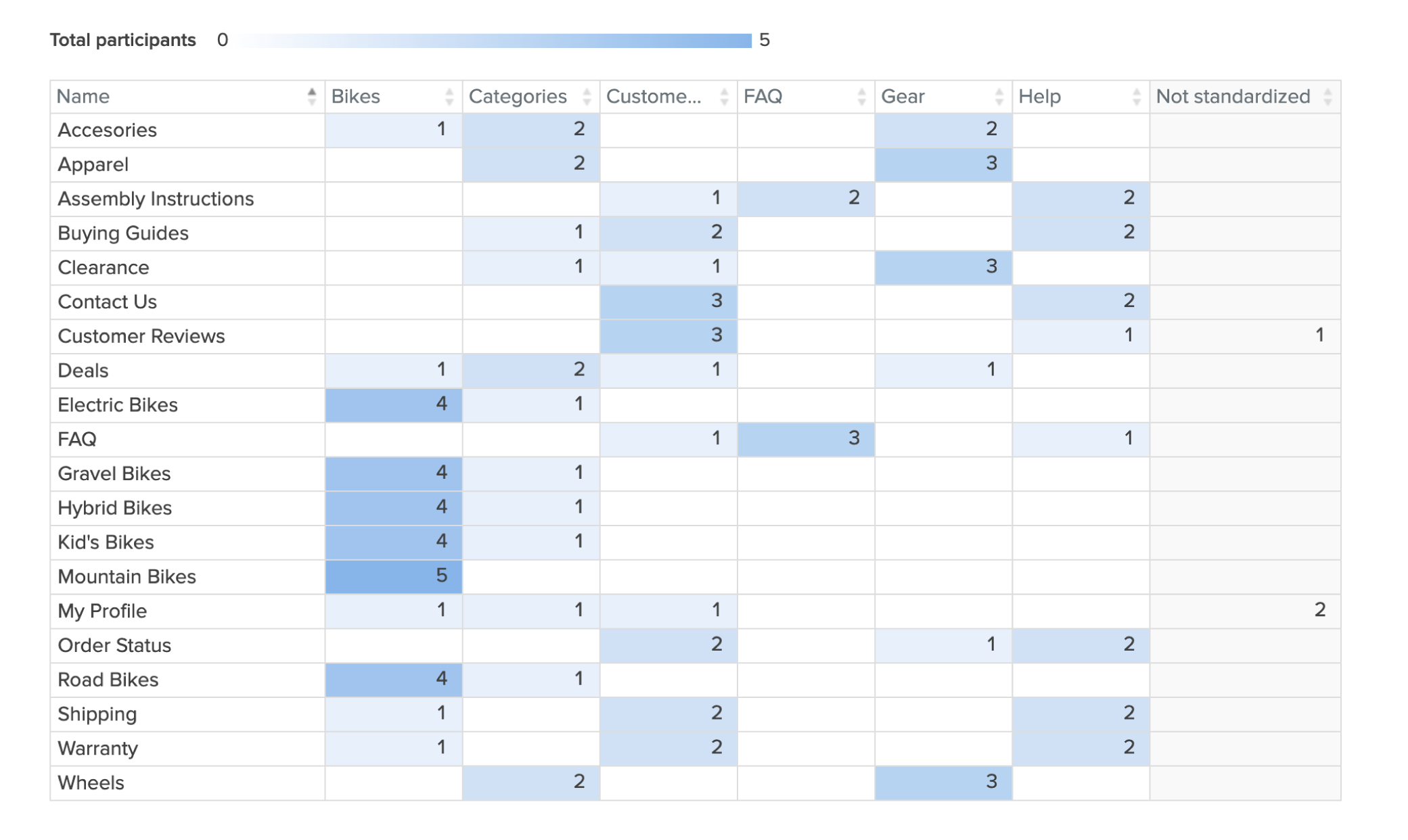
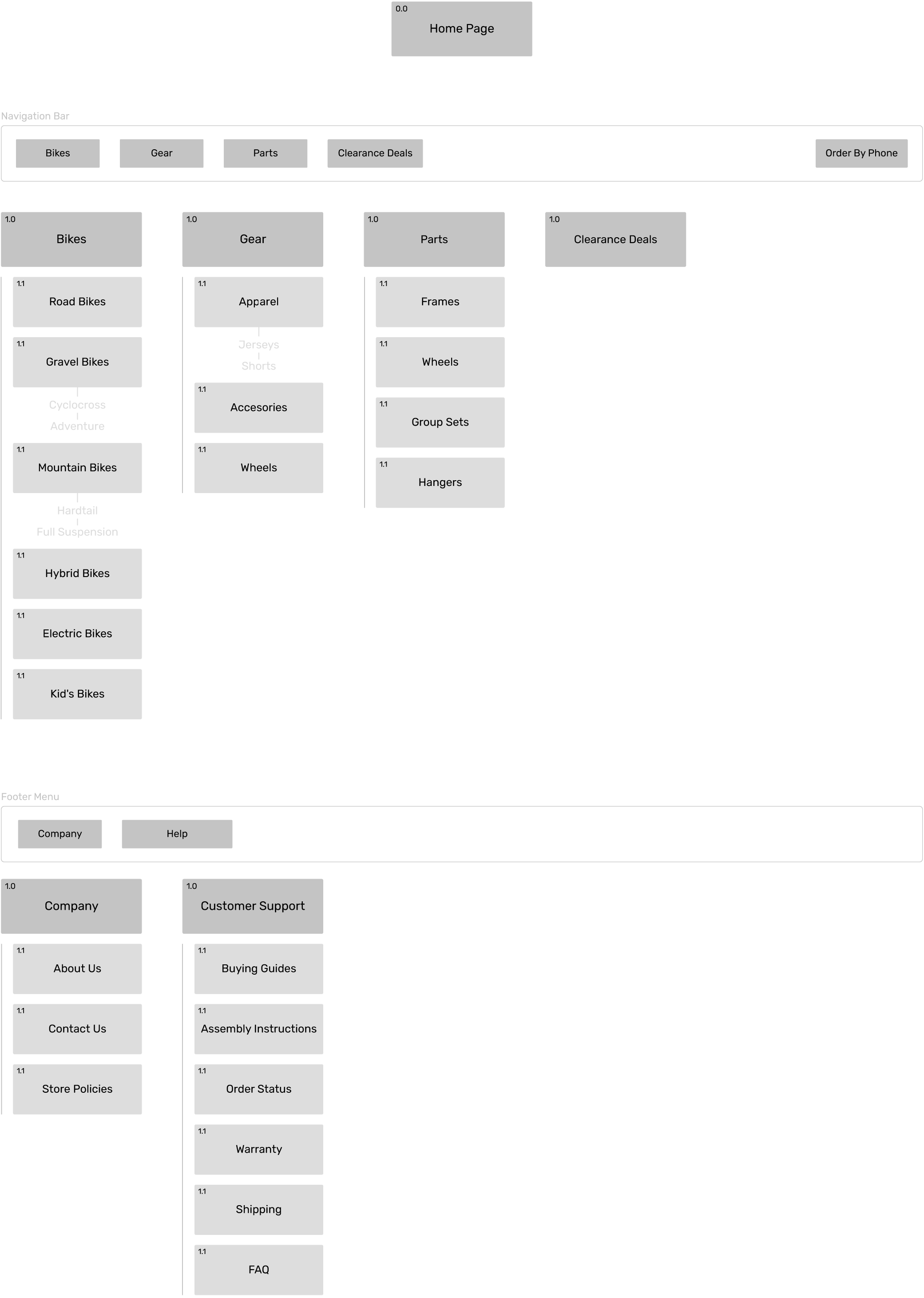
After examining a wide variety of online shops and having a menu framework in place, I decided to refine the site map structure using a card-sorting method. This approach was chosen to prevent making assumptions and eliminate potential redundant menu options. The results aided in categorizing the content as well as removing ambiguous choices, resulting in a more user-friendly navigation menu.
Flow Chart
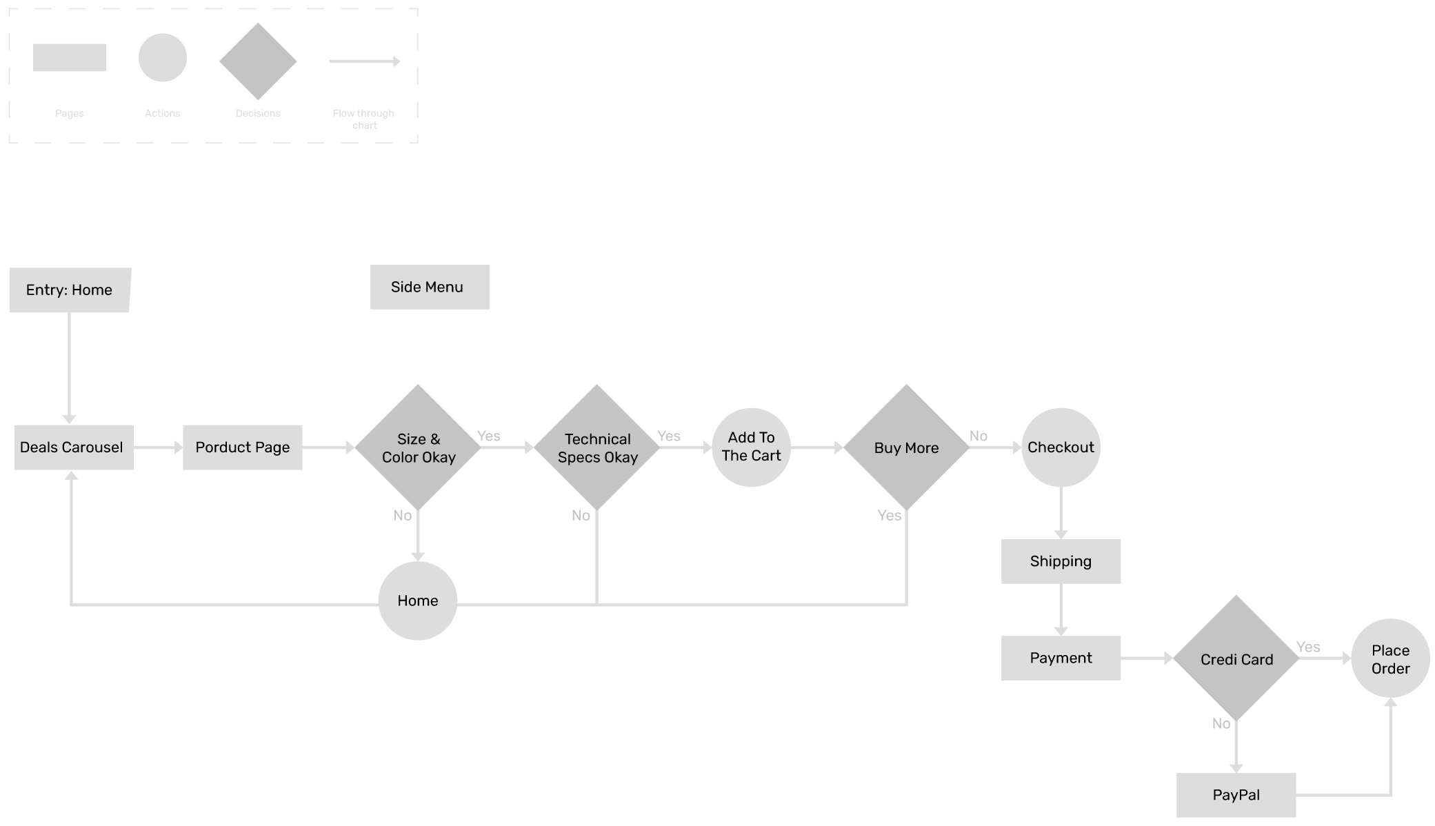
The primary objective of creating the flow chart was to prioritize simplicity, especially since it’s an online shop where having a clear, friction-less path for placing orders is crucial. With the sitemap as my guide, I devised a scenario that guides the user from the home page to the checkout.
Prototype
Wireframes
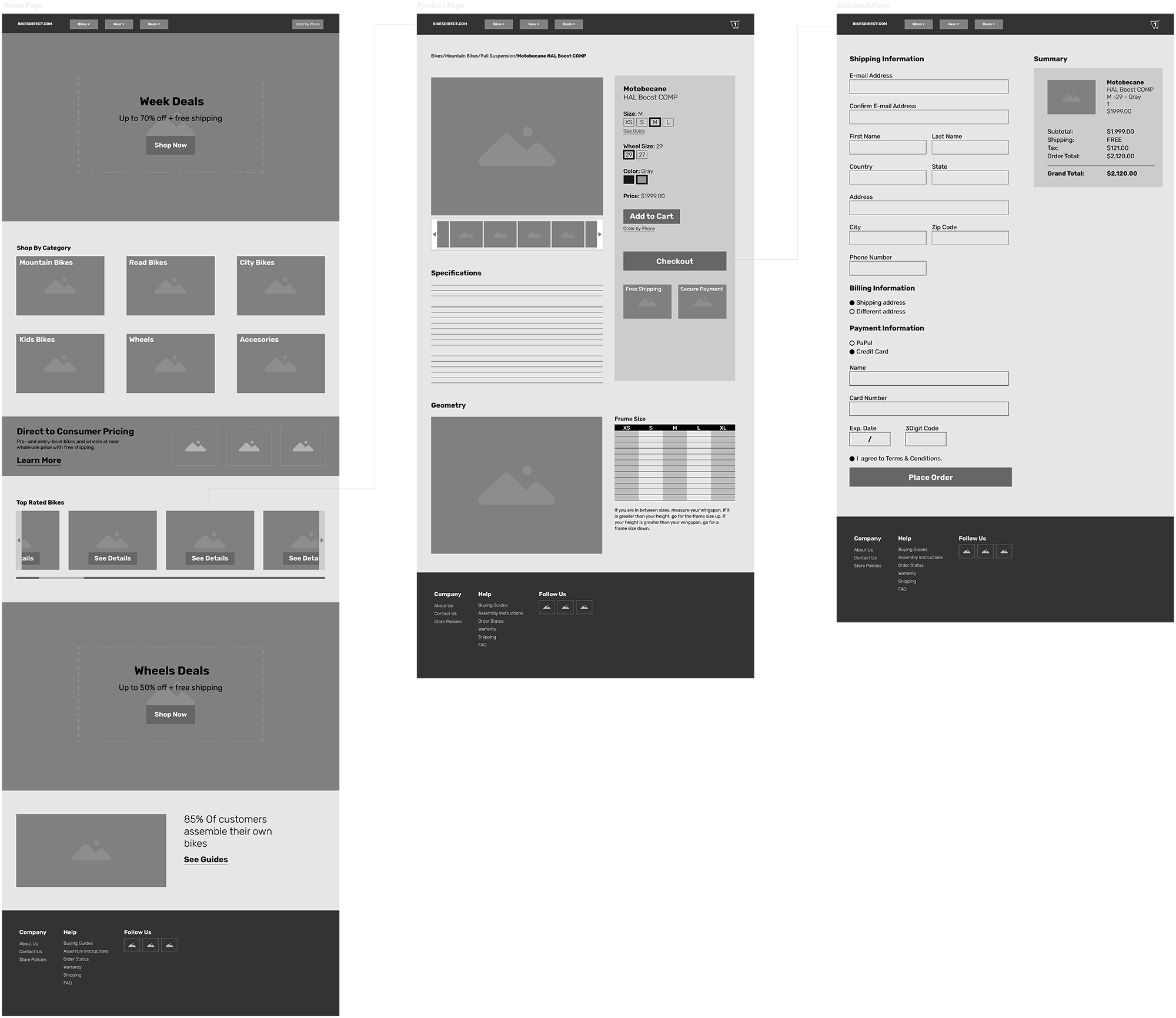
After exploring various possibilities for presenting the homepage content in an appealing manner, I began designing a mid-fidelity wireframe using Adobe XD. The structure of the wireframe is organized based on the research results and business goals, prioritizing elements by their importance.
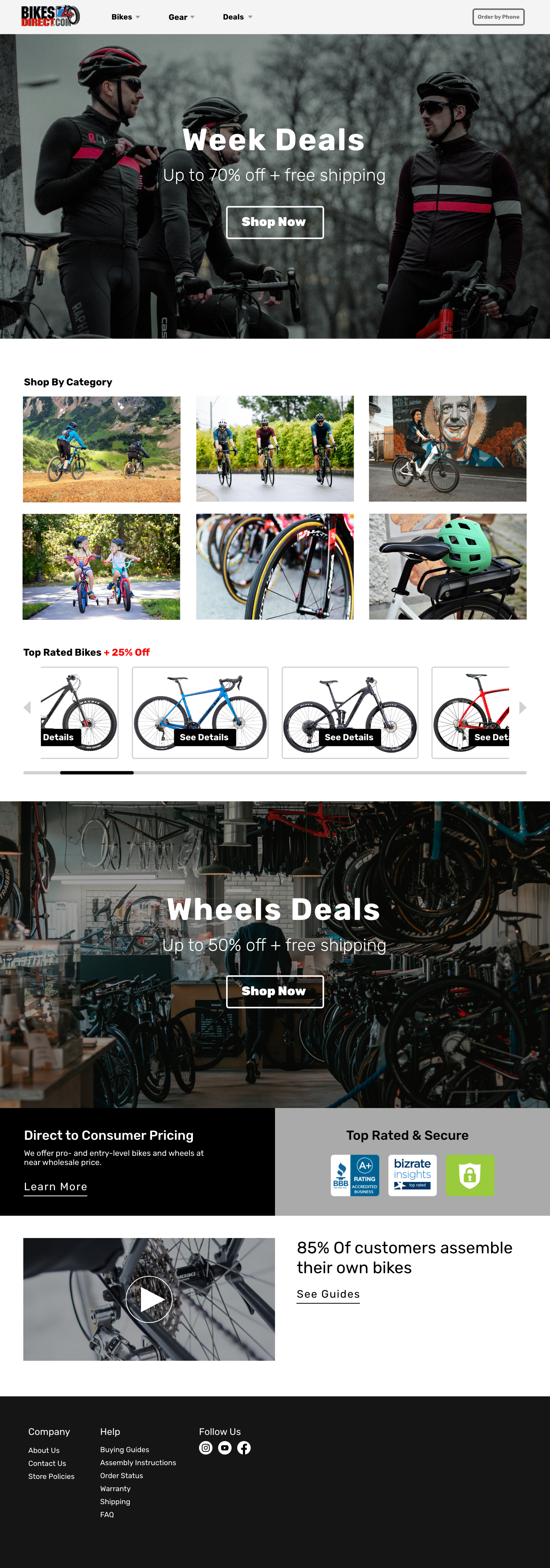
Adventure and freedom are integral aspects of cycling. To enhance the user experience, the interface will feature lifestyle images paired with categories and buttons to assist users in making quicker and more informed shopping decisions.
Additionally, I’m incorporating a section that showcases the company’s rating badges, awards, and information about their business model. This is aimed at fostering trust among users and supporting their shopping experience.
Functional Prototype
Home Page
Product Page
Information Page
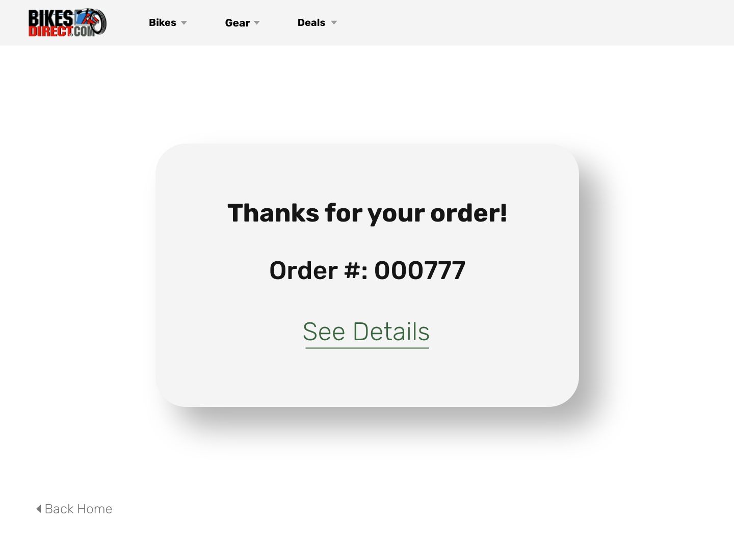
Confirmation
Functional Prototype Video